
Improving Medication List Accurary
In outpatient care, maintaining an accurate medication list is crucial—but rarely straightforward. Limited time during visits, fragmented data from outside organizations, and patient non-adherence all contribute to lists that are cluttered or incomplete. I led a large-scale redesign of medication management tools in Epic’s Ambulatory EHR to help clinicians manage this complexity and keep med lists shorter, cleaner, and more reliable.


74%
Users took a follow-up action
88
System Usability Scale (SUS)
96%
Adoption rate across 450+ orgs
My Role
I led the redesign by breaking down this large-scale project into manageable pieces, identifying key dependencies early to keep the work realistic and focused.
I guided the team through early research, digging into the root causes of messy med lists and making sure we were solving the right problem from the start.
I designed the interactions that would non-disruptively encourage clinicians to take action during med list cleanup—ensuring they felt helpful, not cluttersome.
Throughout the process, I led design reviews and iterated based on feedback from clinicians, carefully balancing clinical clarity with safety and simplicity.
Process
Discovering the Outpatient Medication Reconciliation Space
We began by interviewing primary care clinicians across a range of care settings—academic medical centers, community hospitals, and outpatient specialty clinics—to understand why medication lists often become cluttered or unreliable.
Across the board, we heard the same themes: clinicians lacked the time, context, or confidence to clean up the med list. Several factors contributed to this:
With just 15–20 minutes per visit, providers focused on medications relevant to the reason for the appointment—not addressing older or unrelated ones
When patients reported taking a medication differently than prescribed, providers often didn’t have time to update the orders
For meds they hadn’t prescribed—especially specialty or high-touch ones—providers weren’t sure who managed them and didn’t feel comfortable making changes
To get deeper into the why's, we conducted contextual inquiries at both small and large organizations, observing how clinicians and staff handled medication reconciliation in practice. We saw heavy use of manual workarounds—comments, progress notes, and duplicate documentation—to clarify what the patient was actually taking.
Because practices varied widely, I created journey maps for different clinic types to pinpoint moments where we could make the biggest impact.
Here’s what we saw across most clinics:
Rooming staff reviewed the med list with the patient, asking whether they were still taking each medication and how
Any discrepancies were flagged and escalated to the physician for follow-up during the visit
This was also contributing to clutter on the screen, because if everything looks escalated, nothing is escalated. So we had to identify the use cases that needed the highest physician review
Identifying Use Cases
We grouped the most common types of discrepancies into three core use cases:
Patient is not taking a medication
Patient is taking a medication differently than prescribed
Medication is flagged for removal (via MyChart or during the visit)
For each use case, we collaborated with clinical partners to define appropriate follow-up actions. One of the biggest challenges was ensuring those actions flexed across a variety of drug classes and care contexts—a problem we solved through close iteration and ongoing clinical input.
Backing It with Data
While interviews gave us qualitative direction, we needed a better sense of how often these discrepancies actually occurred. So we analyzed med list data across 200+ customer environments.
Our hypothesis was that non-adherence would be widespread—but the data told a different (and pleasantly surprising) story: In a typical list of 20 medications, only 3–5 were non-adherent. Extremely long med lists (20+ items) were relatively rare.
This gave us confidence to optimize the design for the 80% use case—surfacing the most impactful flags without overwhelming the screen or the physician. We now had a clear sense of how much information we could responsibly show at once.
Designing the Solution
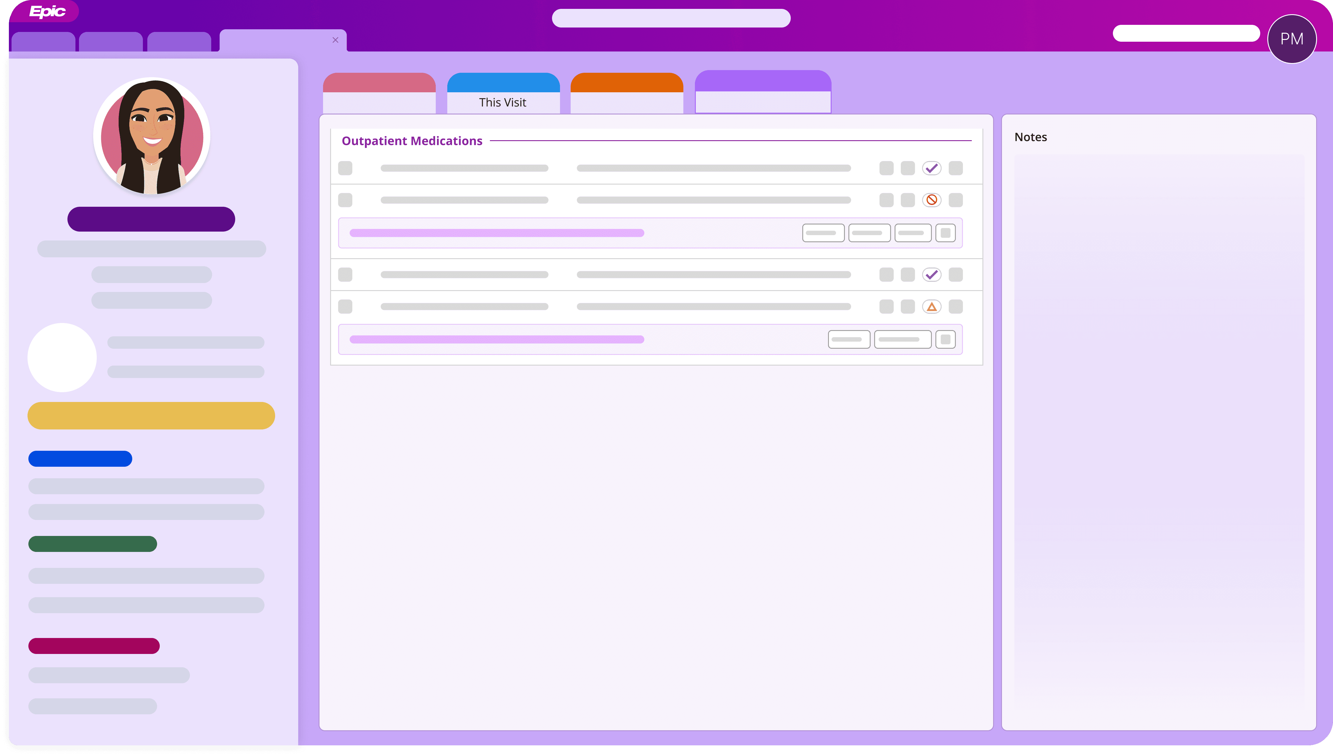
With the core concept in place—offering quick, inline actions for non-adherent meds—we moved into design and iteration.
We began with low-fidelity wireframes to explore layout and interaction patterns. The goal was to keep the UI clear and lightweight in an already busy screen, while making follow-up actions easy to find and act on in context.
Through rapid prototyping and multiple rounds of internal testing with clinicians, we refined the layout to minimize disruption and support clinical trust. We A/B tested several versions and landed on a design that balanced visibility, flexibility, and clarity.
Usability Testing & Iteration
We tested the design with a mix of users across outpatient specialties—including rooming staff, physicians, and nurse practitioners—to validate the experience and uncover any friction points.
Their feedback helped guide key refinements, including:
Clearer labeling of follow-up actions
More flexible interaction options (e.g., dismiss or confirm)
UI adjustments to reduce visual noise when multiple discrepancies were present
We also used this phase to confirm that we’d surfaced the right actions—ones that felt meaningful and safe to take within the visit flow.
Next Steps
The next phase in the product roadmap is to integrate outside medications within the patient's medication list.