
Helping Women Go With Their Flow
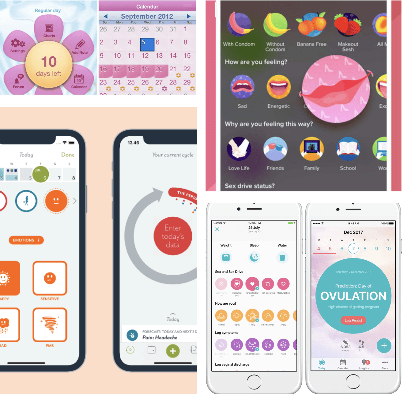
The Period Tracker app offers a refreshing alternative to the typical period tracking apps out there. Most existing options tend to feel overly “flowery” or rely too much on outdated, stereotypical ideas of femininity. This app takes a different approach—with a clean, minimal design and just the right pop of color to keep it feeling warm and approachable, without being cliché.
What really sets it apart is its focus on user independence. It’s designed to grow with the user—as they get more in tune with their cycle, they can rely on the app less. The user flow is simple and non-intrusive, making it easy to log only what’s important to them, without having to click through a maze of features or deal with cluttered screens. It’s all about giving users a smoother, more empowering experience.
UX Design, User Research, Usability Testing, Mobile Design
Challenge
In the U.S., period tracking has become a common habit—especially among women in their twenties. Market research shows that out of roughly 75 million menstruating women, about 45% are using digital tools to track their cycles. But here's the catch: most of them don't actually enjoy the process, especially when it comes to manually entering information.
In the U.S., period tracking has become a common habit—especially among women in their twenties. Market research shows that out of roughly 75 million menstruating women, about 45% are using digital tools to track their cycles. But here's the catch: most of them don't actually enjoy the process, especially when it comes to manually entering information.
Results
I designed a mobile experience specifically for women in their twenties who track their periods regularly, but want something that feels more intuitive and enjoyable. Since this age group often goes through major hormonal and lifestyle changes, the app is built to be flexible and timeless—able to adapt to a wide range of needs while still feeling fresh and relevant.
I designed a mobile experience specifically for women in their twenties who track their periods regularly, but want something that feels more intuitive and enjoyable. Since this age group often goes through major hormonal and lifestyle changes, the app is built to be flexible and timeless—able to adapt to a wide range of needs while still feeling fresh and relevant.
Process
Discovery
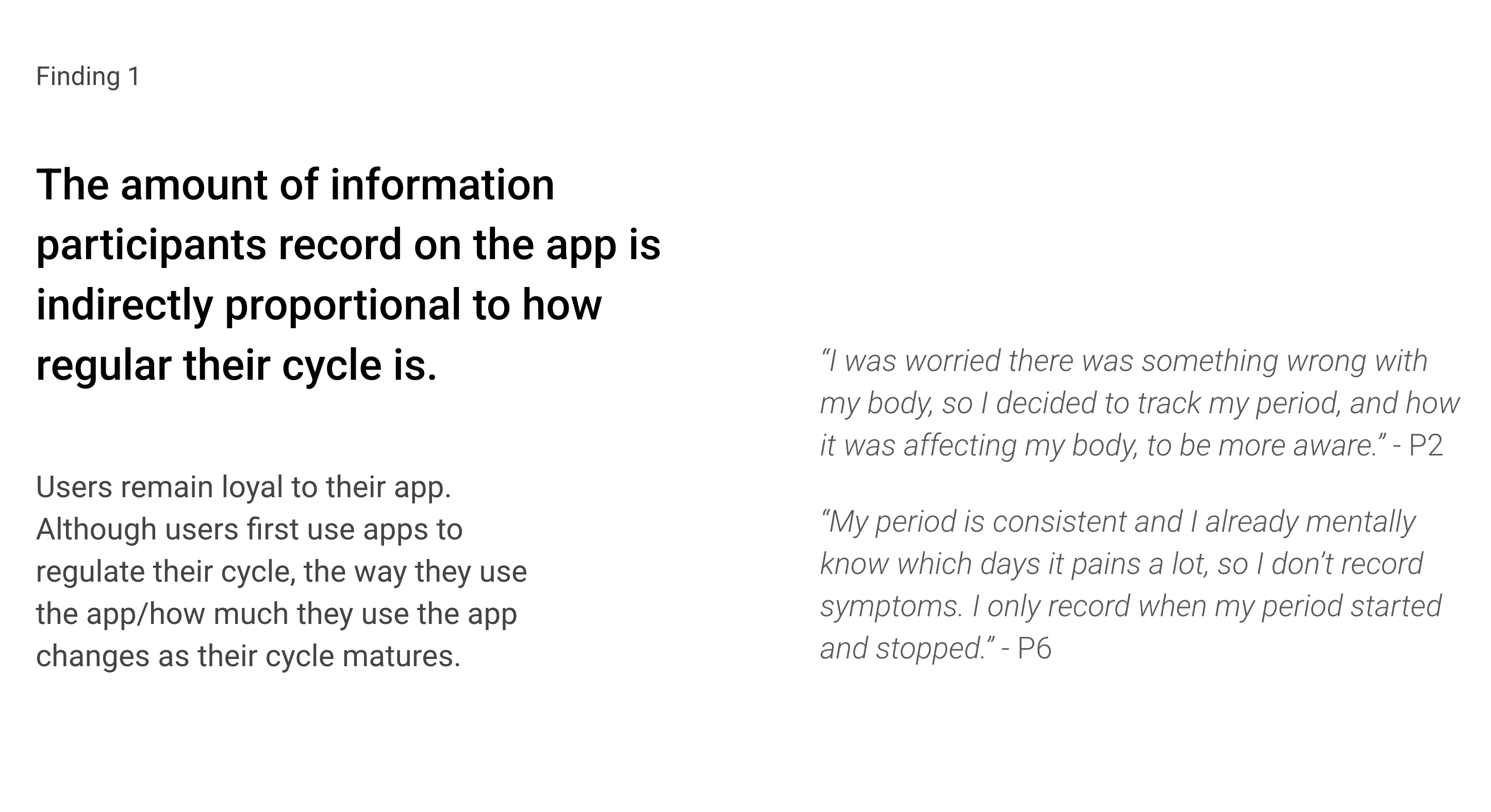
To get a better sense of what’s working—and what’s not—I interviewed six women in their twenties about how they track their periods, what they need from a tracking app, and the pain points they’ve run into.
My Learning Goals
I wanted to understand their current routines, why they track digitally, and what gaps exist in the tools they’re using. The goal was to uncover real opportunities that could help shape a more thoughtful and useful product.
Participant Criteria
I talked to menstruating women in their twenties who:
Use a period tracking app at least once a month
Have been using one for 6 months or more
These were experienced users with habits and insights worth learning from.
Discovery
To get a better sense of what’s working—and what’s not—I interviewed six women in their twenties about how they track their periods, what they need from a tracking app, and the pain points they’ve run into.
My Learning Goals
I wanted to understand their current routines, why they track digitally, and what gaps exist in the tools they’re using. The goal was to uncover real opportunities that could help shape a more thoughtful and useful product.
Participant Criteria
I talked to menstruating women in their twenties who:
Use a period tracking app at least once a month
Have been using one for 6 months or more
These were experienced users with habits and insights worth learning from.


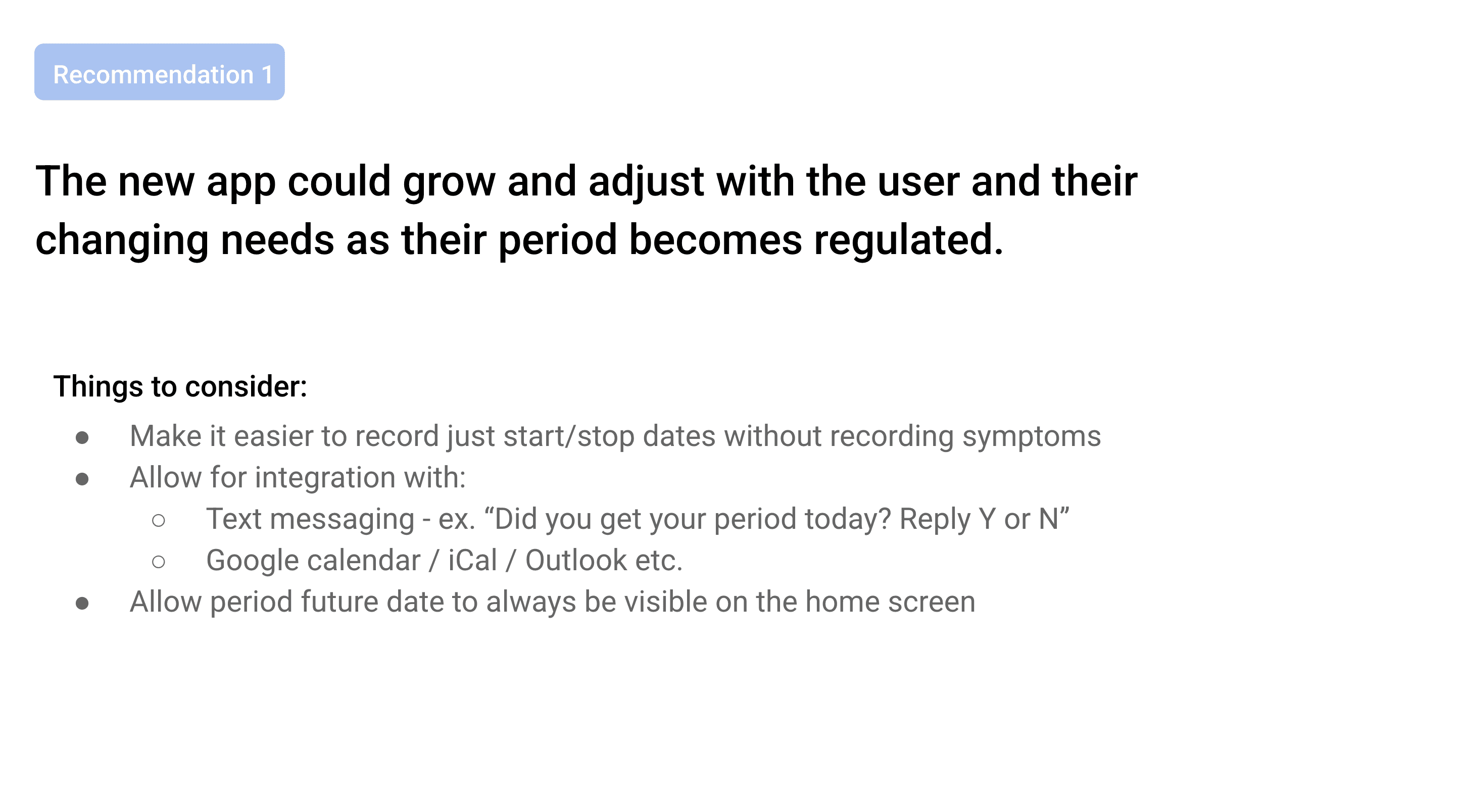
Design
From my research, it was clear the calendar and period prediction needed to be right on the home screen—easy to find, no extra taps. Since most users don’t spend much time in the app, I focused on making it quick and enjoyable to use.
Personalization is subtle but intentional—just enough to feel thoughtful without being overwhelming.
Most people log info in under two minutes, so I went with a vertical layout to speed things up. Simple illustrations add a bit of fun and keep the UI feeling light and approachable.


Iteration
I went through four rounds of iteration to refine the experience:
Accessibility Checks: Used WebAIM to test color contrast, font sizes, and spacing to meet AAA accessibility standards.
Usability Testing: Ran sessions on Lookback to evaluate key flows like creating an account, logging symptoms, and checking the next period date.
Design Performance (KPIs): Users were spending too long logging symptoms—about 20 seconds for just two entries. Navigation wasn’t intuitive, and many didn’t realize they should click the droplet icon to begin tracking. 40% of testers missed it entirely. Even though the droplet had a subtle animation, it wasn’t enough.
Hypothesis: There wasn’t any text guiding users to the droplet.
Fix: I added a short label near the icon and introduced a “Done” button to close the symptom tracker and return to the home screen.A/B Testing: Tested variations of the home screen, symptom logging, and calendar layout to see what clicked best with users.
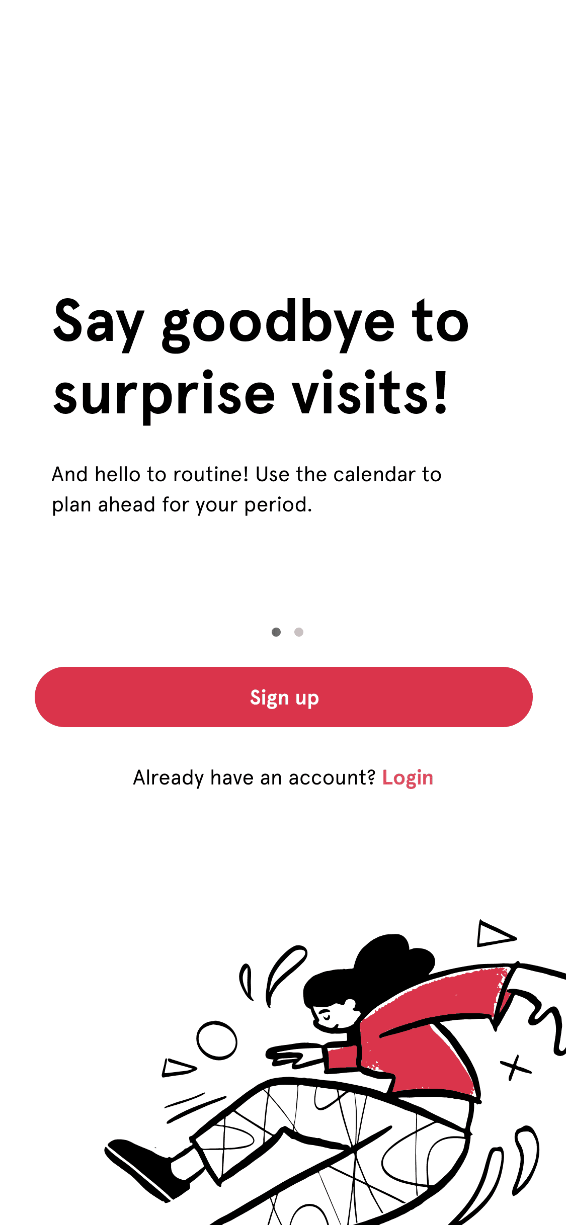
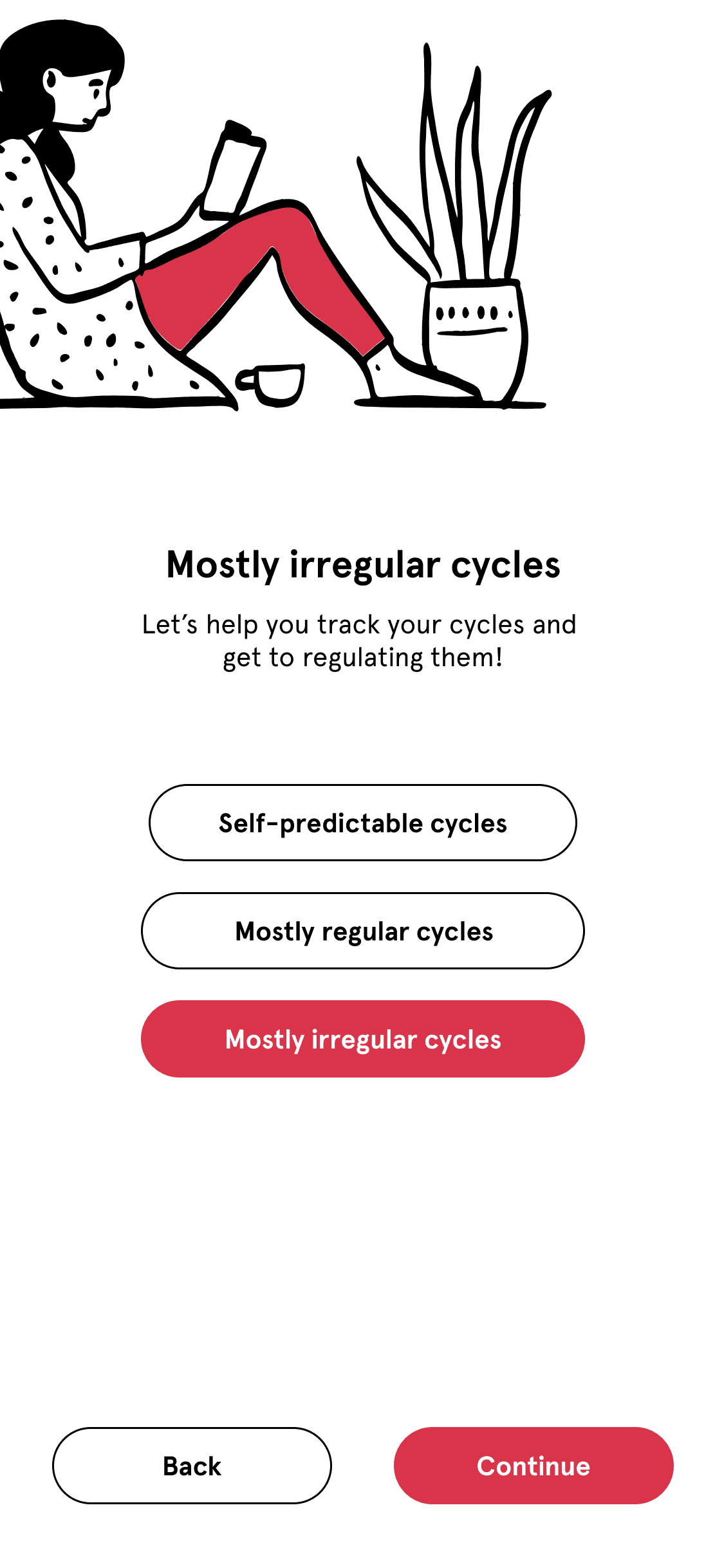


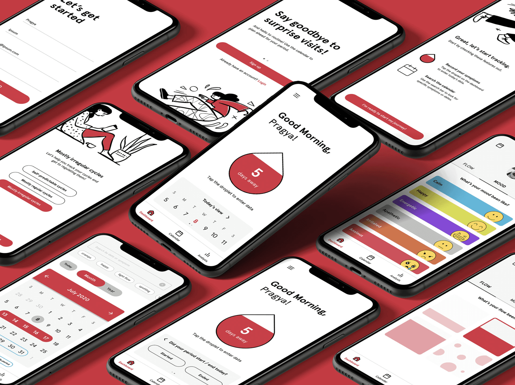
Onboarding
When users open the app for the first time, they’re guided through a few quick questions about their cycle. This helps personalize the experience to match where they are on their journey toward menstrual regularity.
The design and copy are intentionally calming and uplifting—meant to make the process feel thoughtful and welcoming, not boring or clinical.

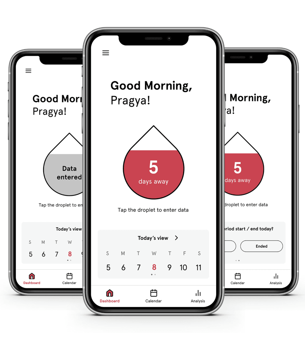
Home
When the home screen loads, a quick animation draws attention to the droplet icon in the center—making it more intuitive to start logging symptoms.
The layout focuses on a clean overview, with the upcoming period date and a week-at-a-glance front and center. No clutter, no distractions—just what users need, at a glance.
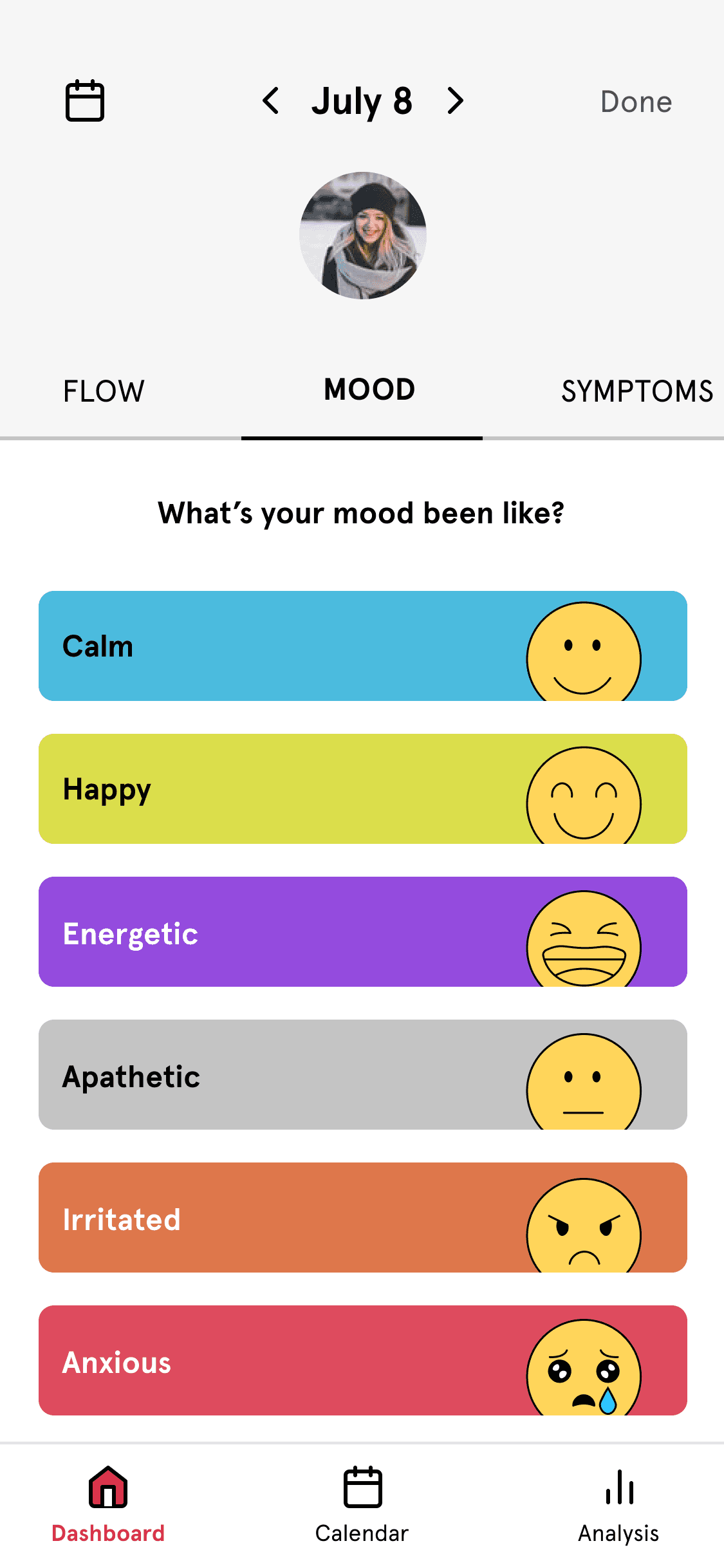
Documenting
Tapping the droplet takes users straight into the logging screen. They can customize the top menu and quickly move through each section to record what matters to them.
Since tracking was often seen as a chore in my research, I added playful illustrations and light interactions to make the experience feel quicker, easier, and a little more fun.

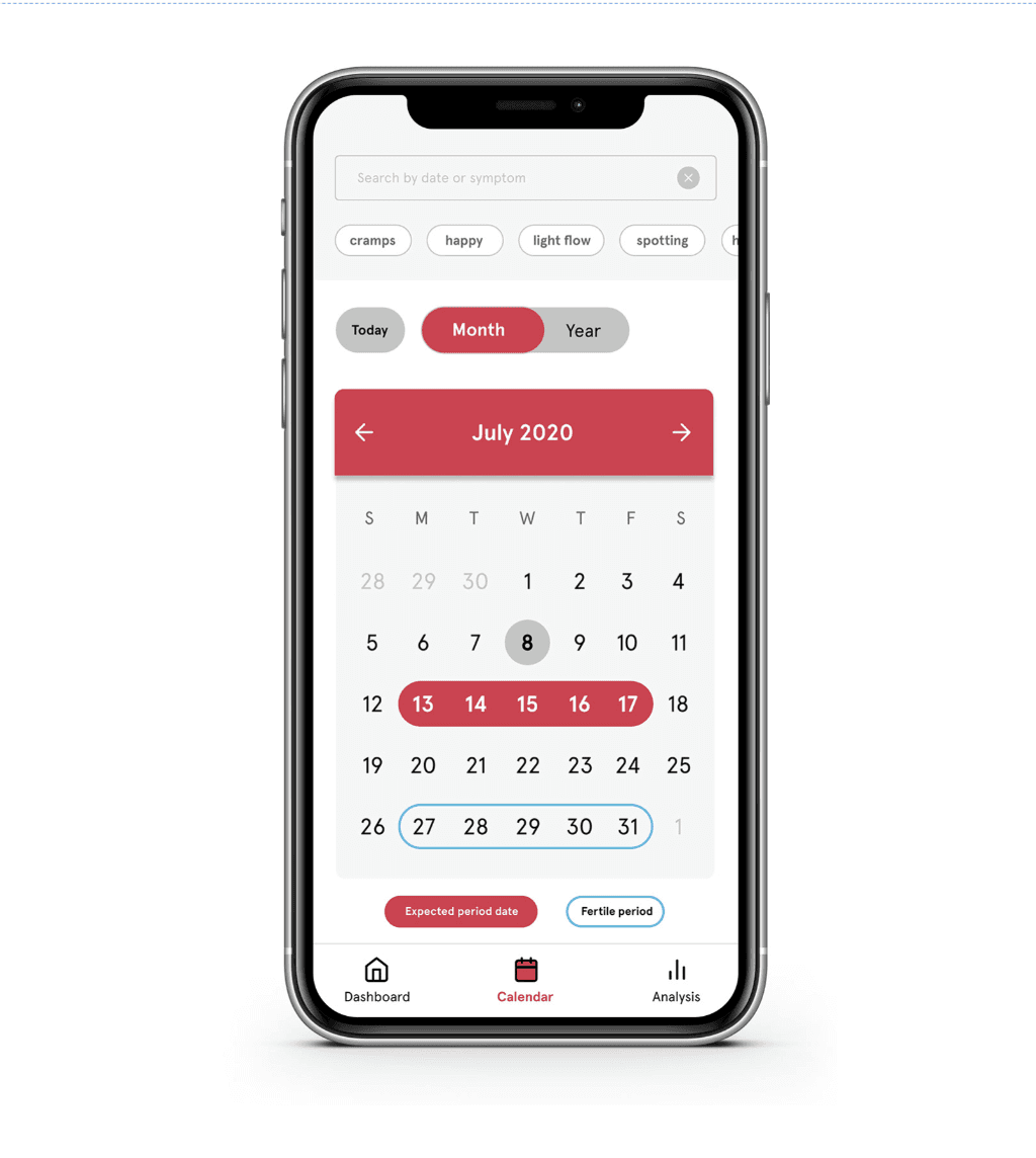
Calendar
The calendar gives users a visual snapshot of their cycle, showing predicted period and fertile days at a glance. They can also search by date or symptom, with helpful filters to make looking back simple and clear.
The calendar is view-only by design. Users shared that having multiple places to log data felt cluttered and confusing—so I kept tracking separate to keep the flow clean.